
Açıklama
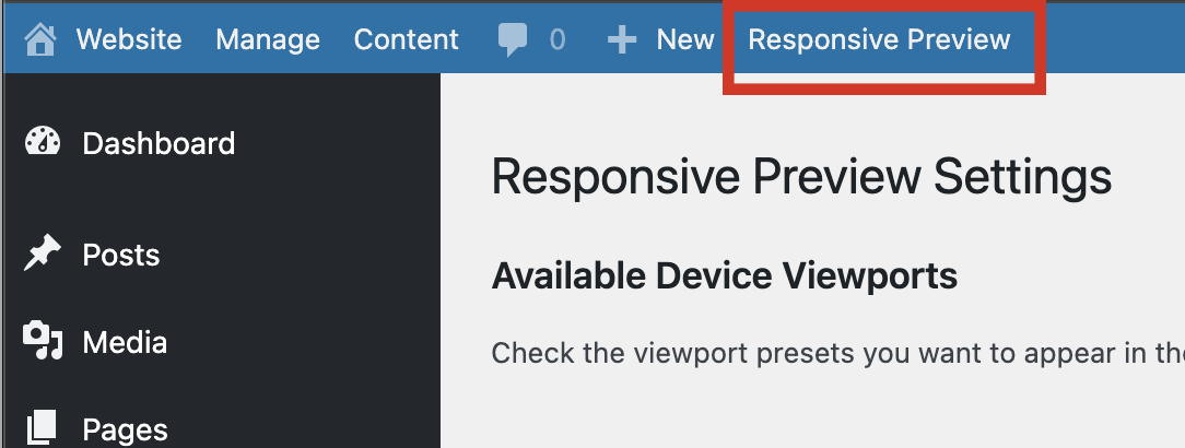
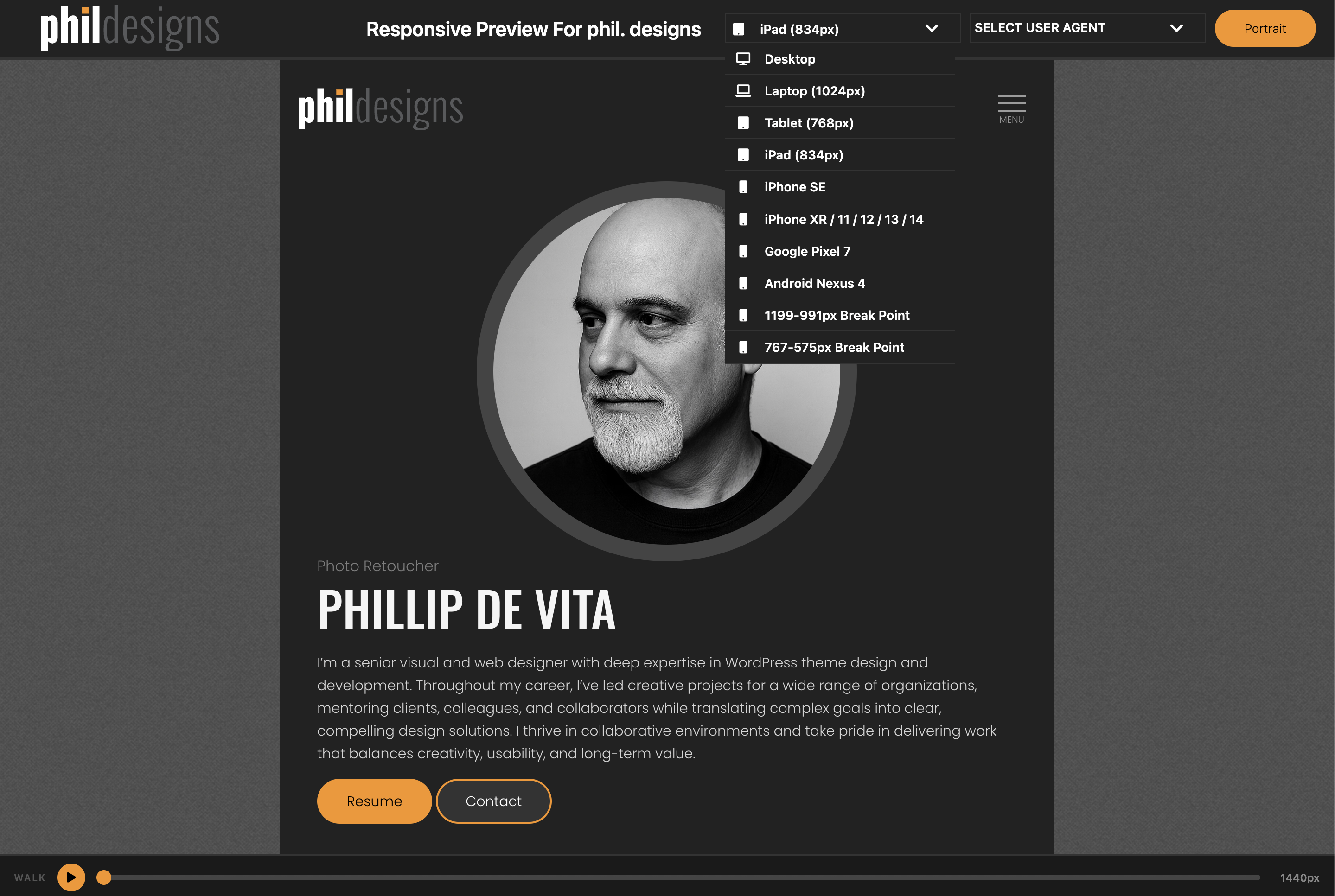
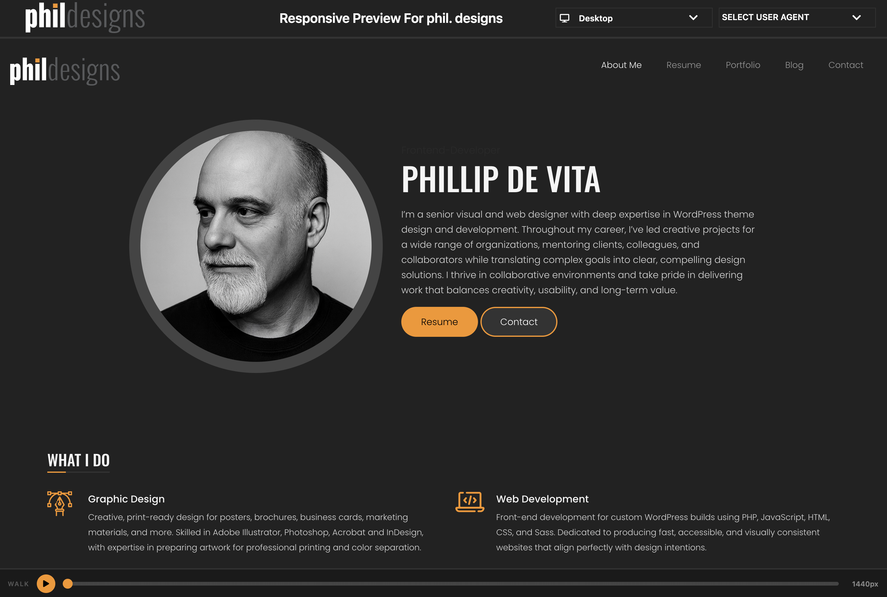
Responsive Preview adds a link to the WordPress admin toolbar that opens your site inside a full-screen preview interface. Switch between device viewport sizes and use the Responsive Walk feature to animate a smooth sweep from 1440px down to 320px.
Features
- Device Viewports — desktop, laptops, iPad, iPhones, Pixel, and more; toggle portrait/landscape on rotatable devices
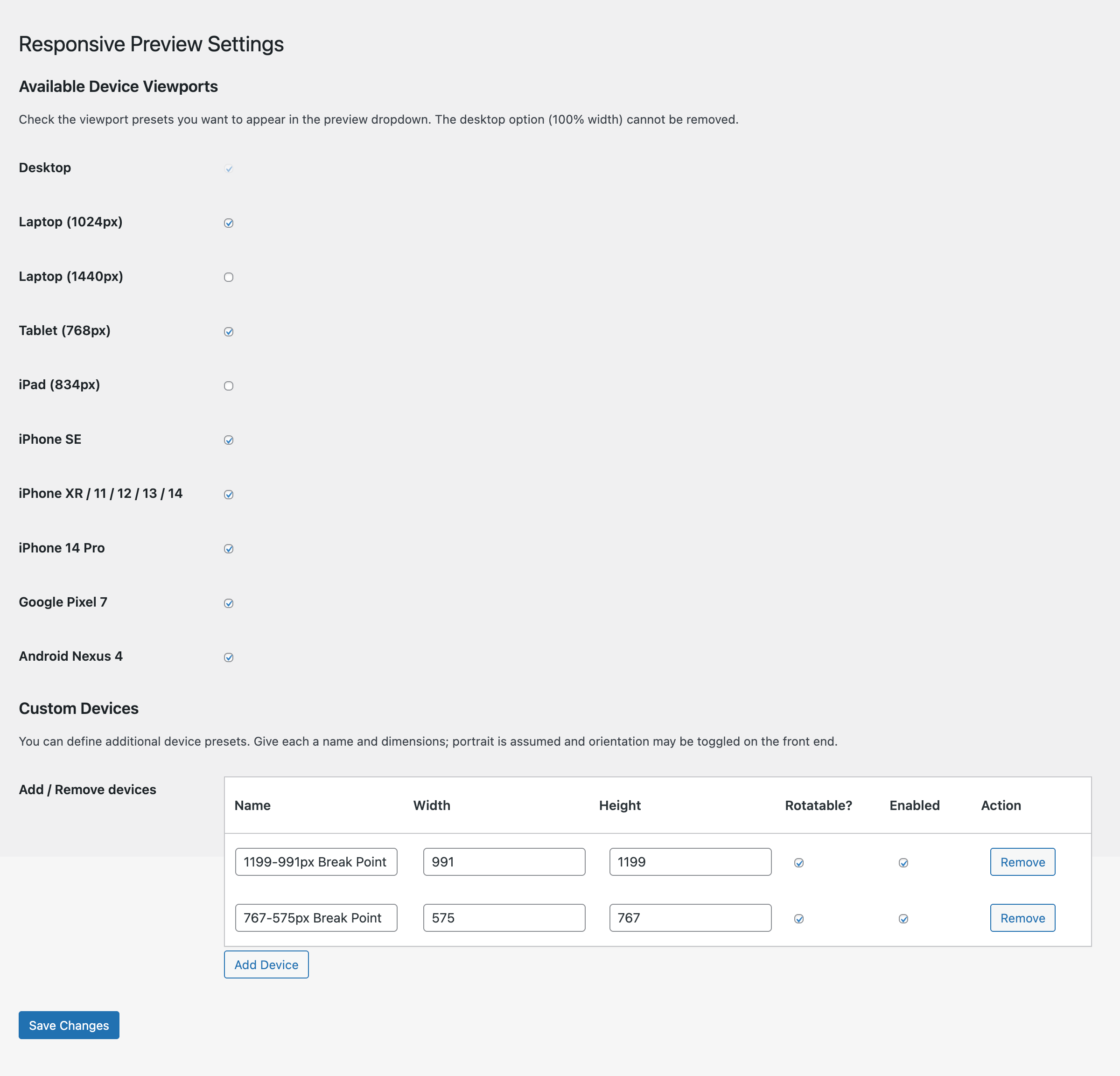
- Custom Devices — define your own device presets with a name, width, and height; manage them from the settings page
- Responsive Walk — play/pause animation that sweeps the iframe from 1440px to 320px over 10 seconds, with a scrubbable progress bar
- Settings page — enable or disable any viewport from the device dropdown
Usage
- After activation, click Responsive Preview in the admin toolbar (top bar).
- A new window opens with your site in the preview frame.
- Use the SELECT VIEWPORT dropdown to switch device sizes.
- Click the orange play button at the bottom to start a Responsive Walk.
Ekran Görüntüleri
Yükleme
- Upload the
responsive-previewfolder to/wp-content/plugins/ - Activate the plugin through the Plugins menu in WordPress
- Click Responsive Preview in the admin toolbar to open the preview
SSS
-
Can I add my own device sizes?
-
Yes. Go to Settings Responsive Preview, scroll to the Custom Devices section, and add as many devices as you like.
-
Why can’t I remove the Desktop viewport?
-
The Desktop option (100% width) is always enabled so there is always at least one viewport available.
İncelemeler
Bu eklenti için herhangi bir değerlendirme bulunmuyor.
Katkıda Bulunanlar ve Geliştiriciler
“PhilDesigns Responsive Preview” açık kaynaklı yazılımdır. Aşağıdaki kişiler bu eklentiye katkıda bulunmuşlardır.
Katkıda bulunanlar
“PhilDesigns Responsive Preview” eklentisini dilinize çevirin.
Geliştirmeyle ilgilenir misiniz?
Kodu görüntüleyin, SVN deposuna göz atın ya da RSS ile geliştirme günlüğüne abone olun.
Değişiklik Kaydı
3.1.1
- Renamed all remaining
rp_function, option, and settings-API identifiers to thephilrepr_prefix (the shorter prefix was flagged as too short by the plugin review)
3.1.0
- Added Responsive Walk — animated iframe width sweep from 1440px to 320px with scrubbable progress bar
3.0.0
- Switched preview bar to flexbox layout
- Moved orientation toggle out of select box
- Added Settings link on Plugins page
- Added support for enabling/disabling viewports and custom device management
- Updated colours, fonts, and styles
2.0.0
- Added viewport dropdown with popular device sizes
- Added FontAwesome icons
1.0.0
- Initial release